Like most service providers, Puget Sound Energy (PSE) was struggling with the load on its call center. Many of the resources and solutions that customers needed were already available online, but hard to find and challenging to understand. So they’d call.
Puget Sound Energy
Get to Zero (GTZ), the project I helped manage, was a major self-service initiative across channels to reduce call volumes: a full redesign of PSE’s website with a service-oriented content strategy on a new platform, a new mobile app, and advanced call center IVR improvements.
My Role
A large creative agency was contracted to redesign PSE’s website and build it on a new platform. I was hired by PSE for my product design expertise to serve as a program manager and advisor for the duration of the redesign through launch, where I worked closely with PSE’s digital experience (web production), marketing communications, and web analytics teams.
I provided oversight, feedback, and direction in design review and planning meetings with the agency’s designers and managers, and PSE team members and managers. Afterward, I met with the PSE teams, managers, and V-level executives for summary recaps of these design reviews, guiding discussions, and clarifying expectations of needed decisions.
Additionally, I led presentations and discussions to inform and guide PSE teams regarding content strategy matters.
Customers were only coming to the website to pay their bill and check power outage maps during storms.
Meanwhile, the call center was handling four million service calls annually.
Content strategy goals were a primary objective of a new website for the self-service initiative.
Early in the process, there were questions from PSE teams about what a successful content strategy looked like. I led a series of presentations, whiteboard discussions, and website reviews to see what other service providers were doing to drive customers to self-help solutions. These weren’t planning meetings to establish content strategy goals. That was a role for others. This was a crash course, introducing the teams to content strategy in action.
Leading by example: A content strategy exercise
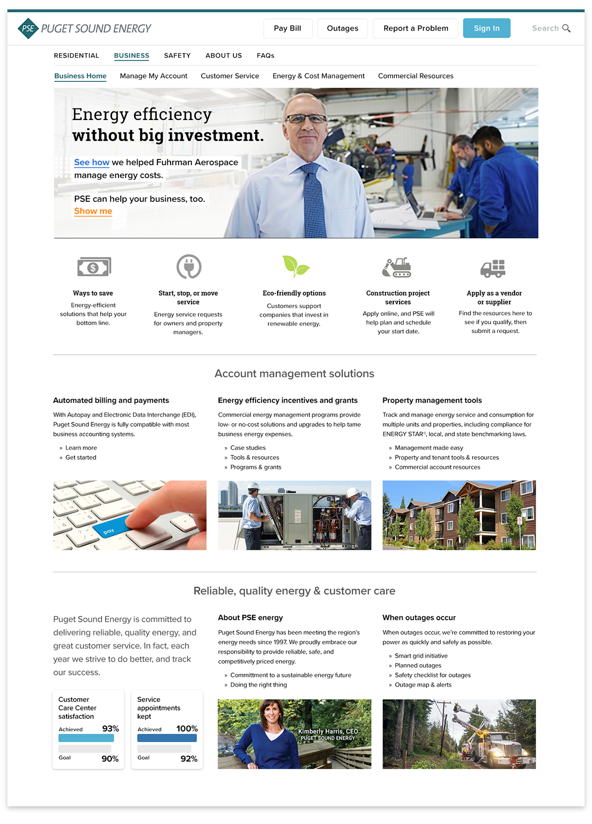
In the final meeting of this series, I presented a conceptual redesign of the business services landing page that I’d created with input from PSE analytics and marketing team members. It was an exercise, not a design proposal. But, by basing the design on real user data, I’d hoped to inspire ideas for developing and applying content strategy goals for the new site.
About the design
Working with the analytics team to discover the information that business customers most often viewed or searched for on the website, I determined categories and groupings, and highlighted them with complementary icons, images, and graphs.
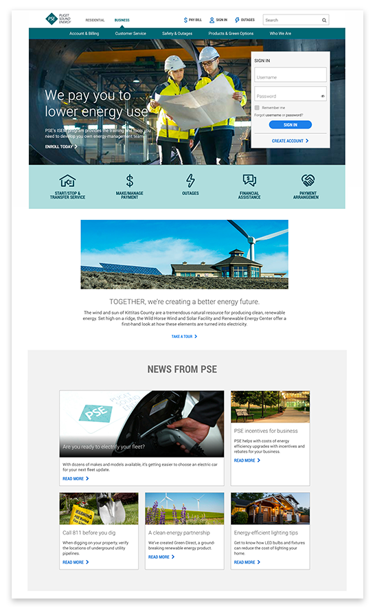
The agency’s final design solution
The agency design for the business services page utilized the same minimalist landing page template as the consumer page. As a designer, I subscribe to the concept of uniformity for a consistent user experience. But the business services section was basically a separate entity with very different goals than the consumer side. We had the metrics showing what businesses were doing, and looking for, on the website, so daylighting more of that information for discoverability would have been a better solution.
The agency design relied on mega menus and search, which assume that the customer knows what they’re looking for, and eliminates the proven discoverability benefits of browsing that allow customers to stumble across other programs or features they may benefit from. More importantly, easy discovery helps reduce calls to the call center, the primary goal of this initiative.
I then met with marketing communications to learn what PSE programs or features that they want business customers to know about. I created a banner based on one of those objectives, adding links to a case study, and how to get started.
The persona was created using a casual interview style to feel more relatable.
PSE staff were understandably frustrated by customers who only visit the website to pay their bill. After all, they work hard to produce content and self-help features for the website! But, better insight into those customers’ actions and needs could help turn those frustrations into connection opportunities for content and avenues of communication.
A typical persona might contain a bullet point that reads something like, “Often needs to make payment arrangements.” But that’s just emotionally detached data that doesn’t capture the essence of your customers.
It would be much more powerful, and encourage stronger adoption by staff, to curate links to relevant news articles, or create social media profiles for the personas that capture the family, socioeconomic, and daily issues they face. This model would keep the personas relevant and fresh in the content teams’ minds, and could help to minimize profile bias by sampling a broader definition of average.
Despite some enthusiastic interest among the teams, my proposal was considered too costly in terms of maintenance for unknown benefit. But in my professional opinion, it’s more costly to not do something like this, especially in the service industry.
The six personas provided by the creative agency predictably ticked the boxes for the initiative’s goals, but lacked any qualities that encouraged adoption and empathetic content development by PSE staff.
A proposal for living personas
Every experienced product professional has had mixed results with personas, and I’ll admit to not always being a strong advocate for them. But when I’ve seen them work, they work well. I believed that PSE would benefit from personas for their content strategy efforts, and worked to encourage their use.
I proposed something different.
Developing a content strategy and writing content with personas in mind requires empathy that can only come from a team that feels connected to them. I wanted to encourage this connection to personas by humanizing them, and had some ideas that I hadn’t seen before. Working with the analytics team once again, I pulled together data on a user type and constructed a narrative from news articles to produce a rough proposal. Any ‘real’ personas derived from this model would have come from richer data, such as call center surveys and survey interviews.
The prototype persona that I proposed:
The existing account page seemed like a task focused payment page because it was being used like one.
To become the self-service account page that PSE desired would require a better understanding of what metrics were actually telling us … and some mild convincing.
A 2024 account page update
In early 2024, I noticed that the account page had been updated, reflecting a trend among account summary/payment pages that feature promotional content mixed with dashboard-like account controls.
With this and other improvements I found throughout the site, PSE has now fully embraced content strategy principles and goals by presenting timely incentives and business communication priorities to customers, even if this is the only page they ever see.
Great job, PSE!
Their next step would be promotional content and incentives that cater to each customer’s profile, instead of generic ones that often miss their mark.
The redesigned account page
The existing account page had the second-highest traffic after the Home page, so it was critical to put this page to work. The most popular billing requests were prominently displayed. The idea of it being a task focused payment page had to go.
But putting new emphasis on this page created new concerns that lingered. Some worried that effectively creating a launching pad for self-service features would detract from all of the other content strategy goals and work going into the rest of the site. In other words, people were asking what the point of doing all the work throughout the rest of the site was, if we were making the account page a destination for all the primary features and information that people were searching for. Links here ARE part of a content strategy.
Many incorrectly thought of the existing account page as a task focused interface for bill payment.
Getting things unstuck.
Differences of opinion. Misunderstanding. Analysis paralysis. These and many other factors often play hell with project schedules, and can shake stakeholders’ confidence that they’re making the right decisions.
Two of the most important duties of my role, were to ensure that design solutions achieved our objectives, and that we kept to the schedule. That meant when we got stuck, it was my job to help us get unstuck. Sometimes that simply meant acknowledging and addressing others’ concerns, other times…were more interesting. However we arrived at a resolution, I’d made sure that managers and execs had what they needed to make informed product decisions.
The account page example
The best example of a stuck situation was the account page. As the page where customers pay their bill, it topped the list of most important pages for the organization, so there were many opinions and firmly held beliefs.
There were no arguments that the existing account page needed to be updated. But that’s where agreement stopped. I had to get to the bottom of this, and understand what the concerns and strong opinions about making changes to this page were based on.
Analyzing the existing account page
Despite navigation and self-service links on the page, PSE staff generally thought of the account page as a task focused pipeline for bill payment, because metrics showed that’s how customers used it.
But the page metrics were misleading. Payment and service inquiries were all being handled by the call center. So, yes, the majority of people coming to this page were there to pay their bill, and not exploring payment option or service links.
Simply stated, the page was not doing its job as an account management resource.


